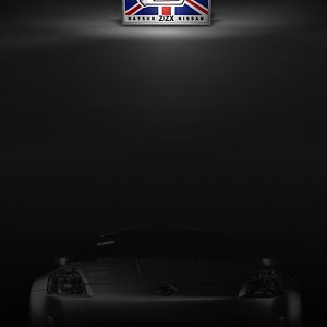
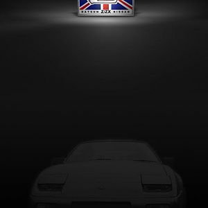
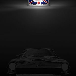
Can't we claim to be the worlds' largest Z Club ? I don't think I like the red text - it looks cheap compared with the redone logo ! And the lower text in blus isn't needed - anyone passing the mouse over the logo will find it's the link ! Better to have some simple images of the cars we cater for - keep it simple for us who like books with lots of pictures in !